-
Run your way to victory with Nike Sports.

August: 29, 2020
By: Hitesh Bhasin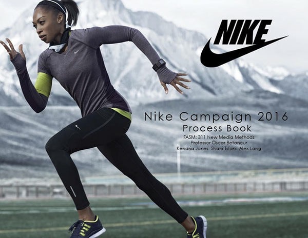
Designed by Hitesh Bhasin Introduction
Nike, Inc., an American multinational organization involved in the design, development, manufacture, marketing, and sales of footwear, clothes, equipment, accessories, and services, created this advertisement. The business has its headquarters in the Portland metro area, close to Beaverton, Oregon. The advertisement was featured on the official corporate website at https://www.marketing91.com/nike-advertising/. The company claims that its goal is what drives them to make all practical efforts to raise human potential. They accomplish this by creating game-changing sports innovations, enhancing the sustainability of their products, cultivating a diverse and creative global staff, and positively affecting the communities they are proud to serve.
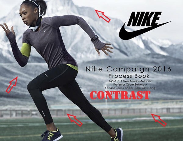
Contrast
As can be seen from the draw-over image beneath, the mountain portion of the design clearly demonstrates the contrast principle, which has also successfully increased visual appeal in the overall design. The Nike addition looks great overall and coordinates well with the other colors thanks to the use of the white contrast color. What the human eye should notice versus what it should ignore is plainly determined by the contrast.
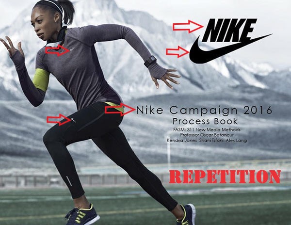
Repetition
This is one principle that, if applied excessively to a design, has the potential to ruin the whole project. Repetition is beneficial since it may be used to highlight a point and make the design simpler to understand. You can plainly see the repetition concept on the information below as well as the Nike emblem in the Nike advertisement because it was used appropriately and didn’t ruin the design.
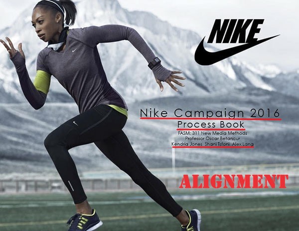
Alignment
The Nike advertisement also demonstrates good use of the alignment principle, which is obviously demonstrated in the text in the image. By using proper alignment, it is feasible to read the text in the image word for word, from beginning to end. The designer of this advertisement employed the correct alignment for the logo and the text to create the reading path the user’s eyes should take when reading the message.
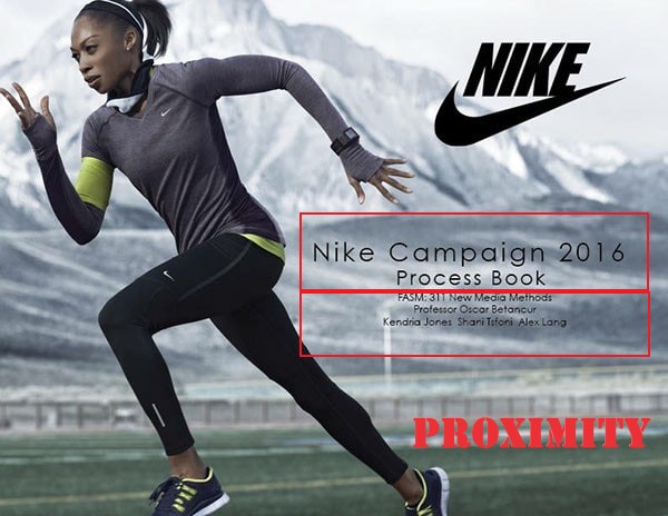
Proximity
As you can see from the draw-over image below, the Nike advertisement effectively used proximity. The set of related products is clustered together and they are close to one another, making them easier to identify as related than unconnected. Reading the text would have been a little more difficult if the advertisement had been aligned incorrectly, and there’s a good probability that potential customers would somehow lose interest in the ad as well as the product you are trying to sell.
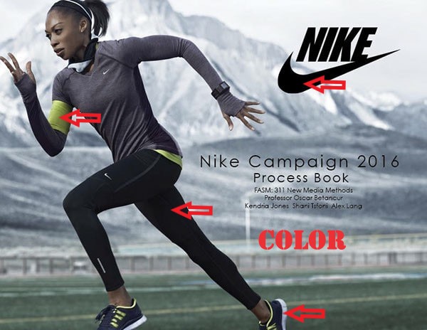
Color
The colors used in the design were well chosen and blended in perfectly. because they are neither too light nor too dark The colors fit perfectly in the ad because they somehow match the color of the logo. There is a black color in the background that also matches the color of the logo, as you can see from the image below. A good color combination makes the overall design look amazing and eye-catching. The color of the mountain also has a white color that is also found on the lower part of the shoe.
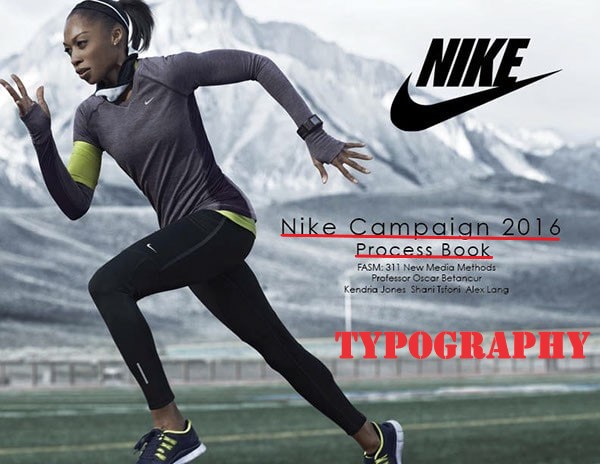
Typography
The typography used in the ad was really good-looking and appealing, easy to read and follow from the start right to the end. The spacing between characters was consistent, especially in the first heading and the second subheading. Even though the first heading appears to be larger than the second subheading, it makes reading the text in the ad easier, and every word in the design begins with a capital letter and is consistent throughout.
Conclusion
The designer did an excellent job on this design, besides the fact that even Nike company endorsed it and used it on their official website. This image works well for the project because proper measures and standards were followed accordingly when the design was in progress.
-
Boost your Self-confidence beyond limits with Adidas…
By Adidas America, Inc.
Posted on April 30, 2022
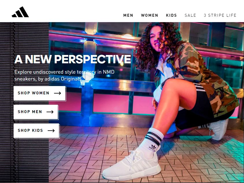
Designed by Adidas Introduction
This amazing ad was created by the Adidas Company. The amazing ad was found on the company’s official website @ https://www.adidas.com/us where they advertise all the products that the company sells. Using the online store customers and other businesses around the world are able to purchase the Adidas stunning products online and have them shipped to their desired location almost anywhere in the world. Some of the products Addidas has to offer include footwear, clothing, accessories, etc for people both males and females as well as kids. One of the coolest features of the Adidas shoes is they come in a variety of different colors, sizes, different makes, at different prices suitable for all customers, and can be used for both sporting activities and fashion.
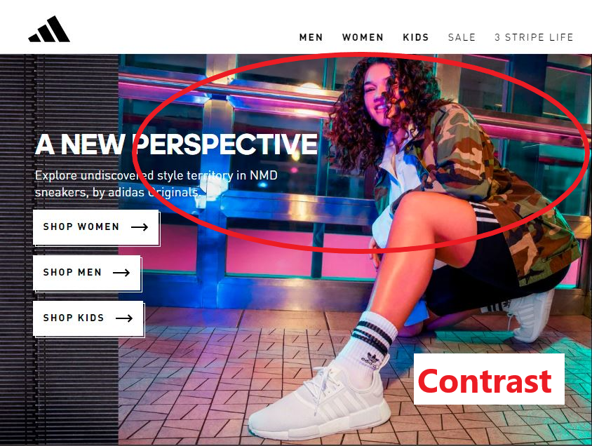
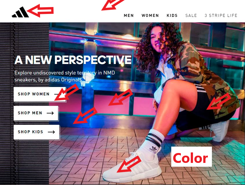
Contrast
The facial part of the design clearly shows the principle of contrast that has also created a good visual interest in the overall design as seen from the below draw-over image. Using the pink color for the contrast made the overall design looks very nice and also match well with the rest of the other colors.
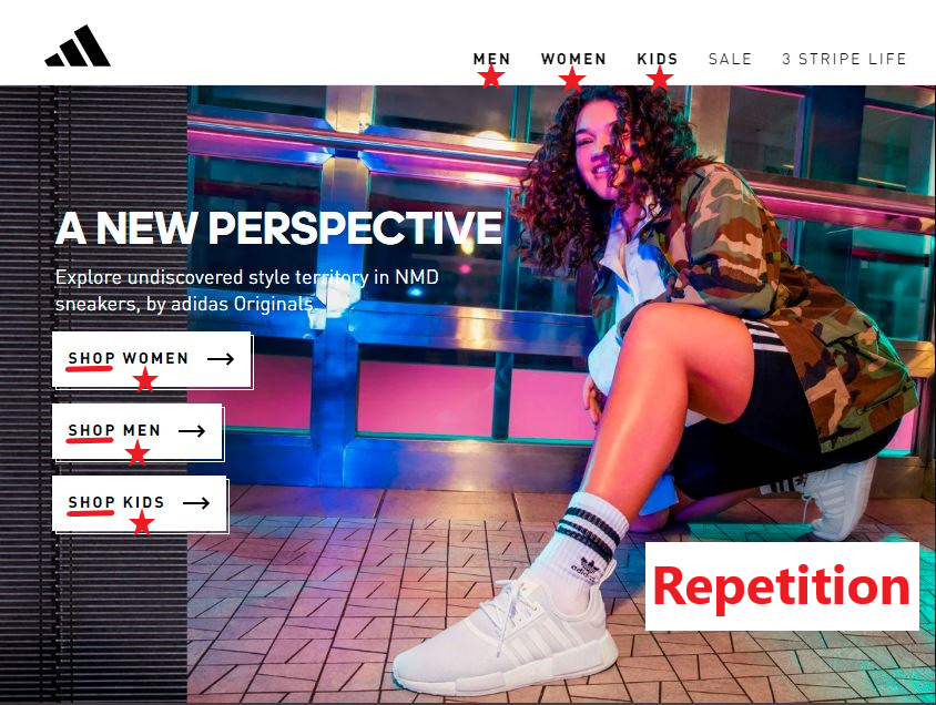
Repetition
This is one principle that can be sometimes overused on a design to an extent of ruining the overall design if overused. In the Adidas ad, the repetition principle was used to the appropriate level, it doesn’t create any destruction to the design and you can clearly see the repetition principle on the sub-heads with consistent spacing.
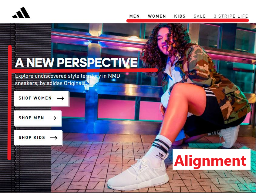
Alignment
We can also see from the ad that the principle of alignment is clear. The designer used the left alignment on the text creating a formal look for the user’s eyes to spot where to begin viewing the text and exactly where to stop.
Proximity
The ad clearly demonstrated the use of proximity very well, as you can see from the draw-over image below that the group of related items is grouped together and they are close to each other making them easily identified as related than unrelated.
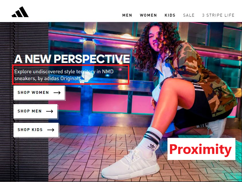
Color
The colors that were used in the design were nicely selected and fit in perfectly. Some of the colors in the background resemble that of the official Adidas logo which is black and white. As you can see from the image below that the same colors were once again used in the inside part of the design to maintain a very good color combination, especially with the side window background colors.
Conclusion:
I believe this ad design was very excellent for the COMM 130 Reverse Engineer Post assignment as the designer was able to use the four design principles of contrast, repetition, alignment, and proximity accurately, as well as the colors, were nicely presented in the ad making it easy to analyze. I can safely the designer did a great job on this ad.
-
Subscribe
Subscribed
Already have a WordPress.com account? Log in now.
